
Hatla2ee
Built around goals
not pages.
Redesigning Egypt's largest automotive marketplace around the way people actually think and decide.

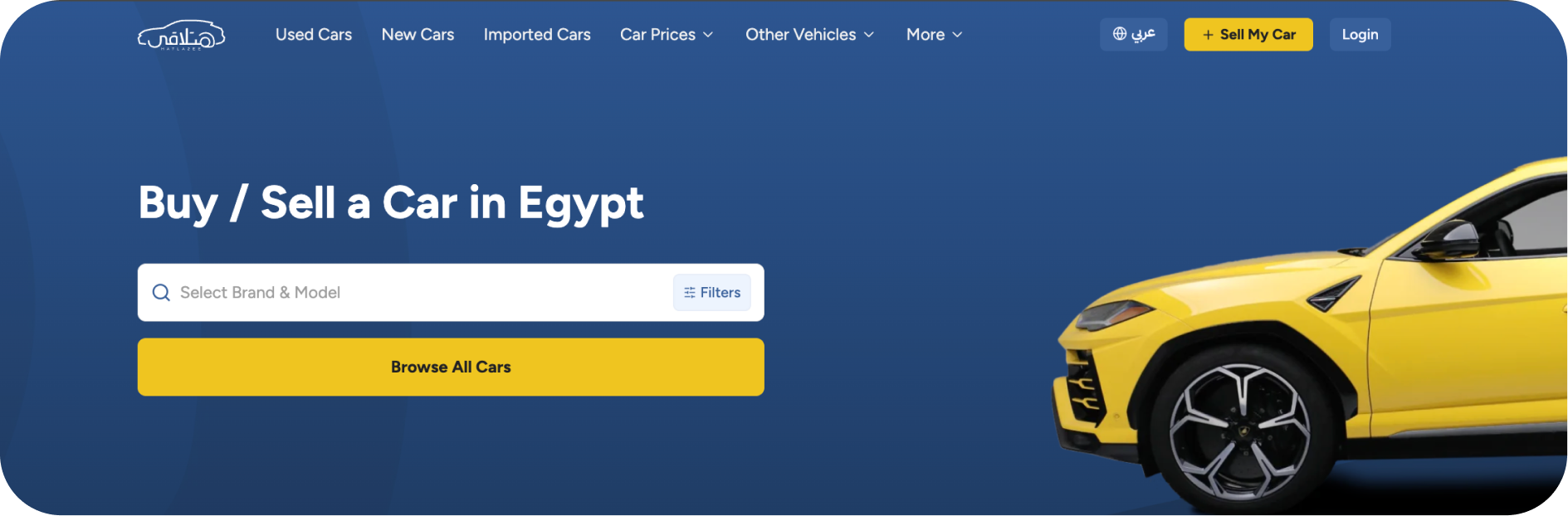



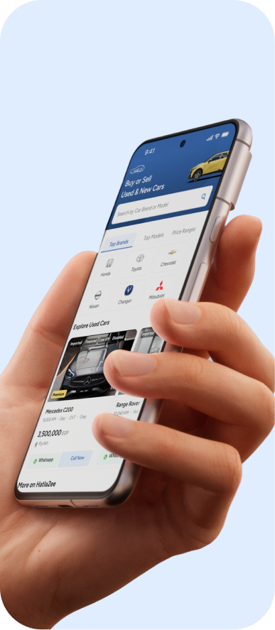
Redesigned Hatla2ee's navigation and discovery experience as the marketplace grew from car listings into a full automotive ecosystem.
Led research and design end to end — journey mapping, competitive analysis, Crazy 8s, wireframes, and the final navigation system.
Reframing navigation around user goals instead of content types became the foundation for every screen that followed.
A buyer-side fix that ignores the seller side isn't a fix — it just moves the friction somewhere else.
Growth added complexity nobody had redesigned for.
Hatla2ee grew from a car marketplace into a complete automotive ecosystem. As new services and features were added, the experience became harder to navigate, making it more difficult for users to find what they needed with confidence.
People came to buy, sell, finance, or discover. The experience asked them to navigate pages instead. The result was a marketplace that felt harder to navigate, harder to trust, and harder to decide.
A double diamond, start to finish.
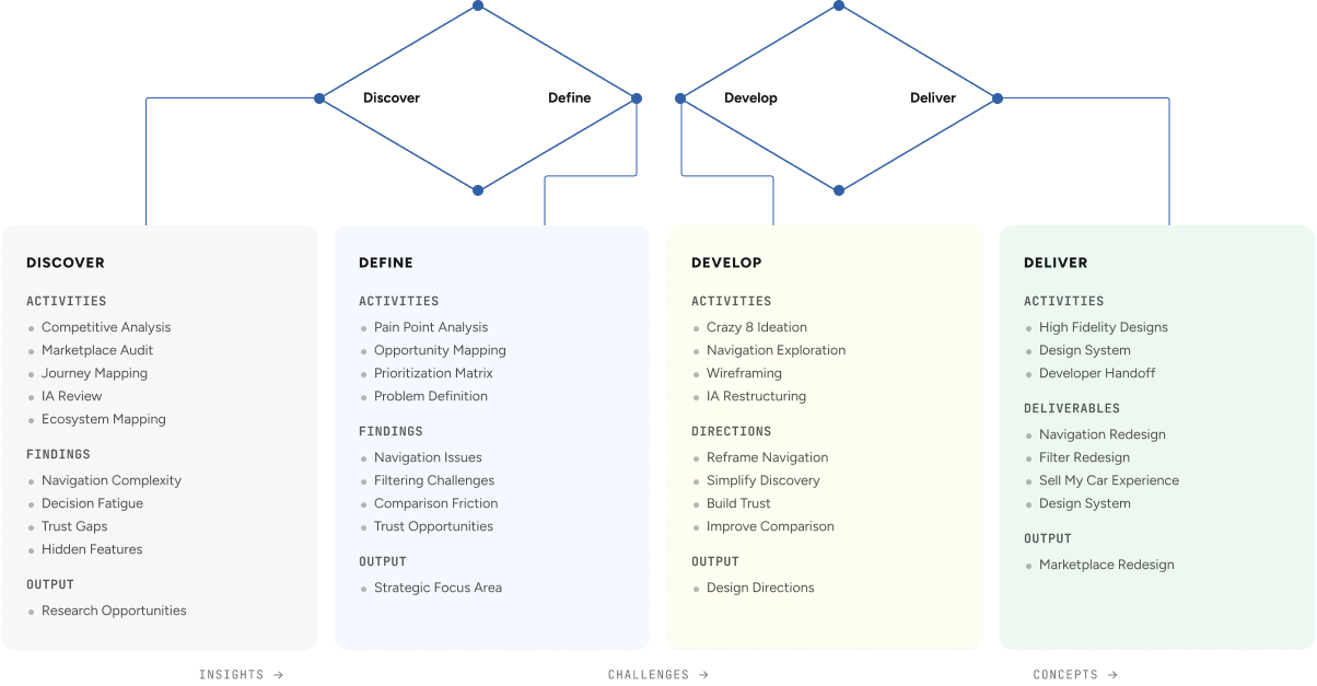
I looked at the marketplace from every angle before touching a screen.
Before redesigning the experience, I wanted to understand why it felt increasingly difficult to use. Rather than jumping into solutions, I analyzed the marketplace from multiple perspectives to uncover where users struggled, how the product was organized, and what was preventing confident decision-making.
{{ m.label }}
{{ m.body }}
I talked to car buyers before designing anything.
I ran one-on-one interviews with people who had recently searched for a car online. I wanted to learn how they start, what they filter by, what they trust, and why they give up.
- What do you look at first when searching for a car online?
- Do you start with a specific car in mind, or explore?
- How much do looks matter compared to specs?
- How do you usually start: search, filters, or scrolling?
- Which filters do you use most?
- Many listings at once, or fewer with more detail?
- How often do you compare cars before deciding?
- What are your dealbreakers?
- Do you trust online listings, or need to see the car?
- How much do reviews and seller ratings matter?
- Do you prefer negotiating or fixed prices?
- What frustrates you most when searching online?
- Have you ever given up on a search? Why?
- What tools would make buying easier?
- Mobile or desktop, and why?
Most people already had a brand or model in mind and wanted to type it straight in.
Price, model, year and mileage mattered. The rest felt like noise.
People switched between tabs to compare specs side by side.
Missing info and unclear sellers were the main reasons people gave up.
Mapping the buyer's journey, end to end.
The journey map showed where users hesitated, where confidence dropped, and where the experience needed to provide better guidance.

Where the flow breaks down
I mapped the steps from homepage to lead and marked where users got stuck. Most problems came from filters, listing quality, comparing cars, and trusting sellers.
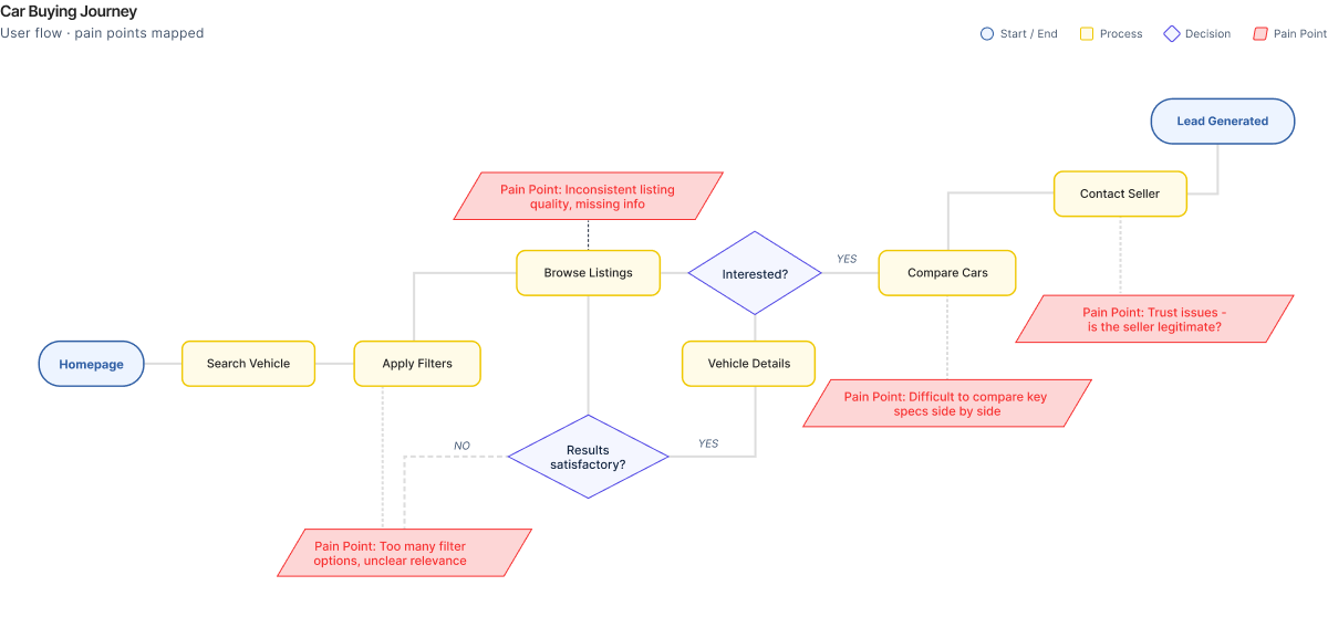
Journey mapping, the marketplace audit, and the competitive analysis kept surfacing the same six problems.
{{ f.n }}. {{ f.title }}
{{ f.body }}
Everyone invested in listings. Almost no one invested in decisions.
The analysis showed that competitors invested heavily in inventory and listings, but less in helping users compare options, build trust, and make confident decisions.
{{ c.strength }}
{{ c.weakness }}
→ {{ c.opportunity }}
Eight fast sketches, before one slow decision.
Crazy 8s helped quickly explore different navigation concepts before selecting the solution that best balanced user goals, business needs, and implementation feasibility.
{{ p.title }} — {{ p.body }}
From a grid of buttons to a search-first home.
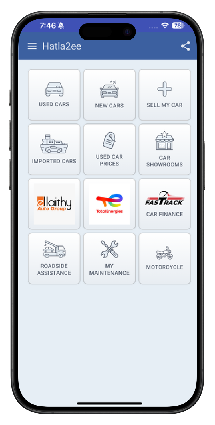
A grid of 12 equally-weighted buttons. No hierarchy, no search, no sense of where to start.
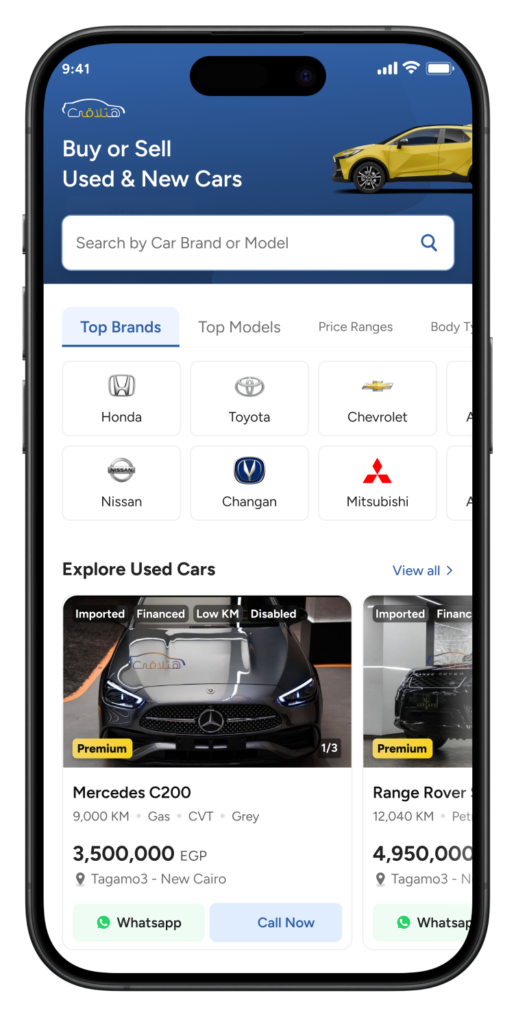
Search leads. Top brands surface immediately. Listings carry the trust signals people needed to decide.
Five paths replaced fragmented navigation.
Instead of asking users to understand the platform, the redesign met them where they started — with a goal. Five clear paths, Buy, Sell, Finance, Discover, and Account, replaced fragmented navigation built around content types.
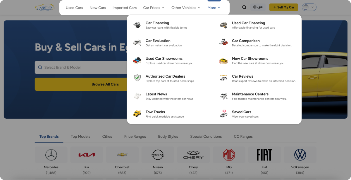
Research revealed that users didn't think in menus or content categories. They thought in outcomes. The navigation was redesigned to reflect that mental model — every feature findable through the goal it serves.
Once I got the structure right, the screens were easy. Good research made the design decisions obvious.
This is how I like to work: understand the problem broadly, narrow in on what matters, explore several solutions, then commit to the one that fits best.